Premium skincare brand identity rooted in natural ingredients and science-backed formulations.

NVKA is a skincare startup rooted in research and inspired by Indian beauty traditions, focused on creating organic, high quality products designed for long term skin health rather than shelf life. The brand was built around purity, intentional formulation and transparency.
Building the brand from the ground up
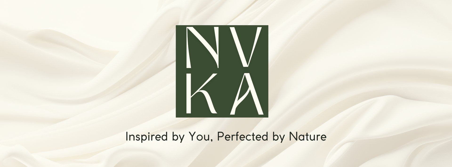
The partnership began at the foundation. Work included brand development, naming and positioning, shaping NVKA into a distinct and ownable skincare identity. The name NVKA is derived from “Anvika,” reflecting individuality, care and intention, and was selected to align seamlessly with the brand’s values and long term vision.
Every element of the brand was developed to feel thoughtful, refined and authentic.
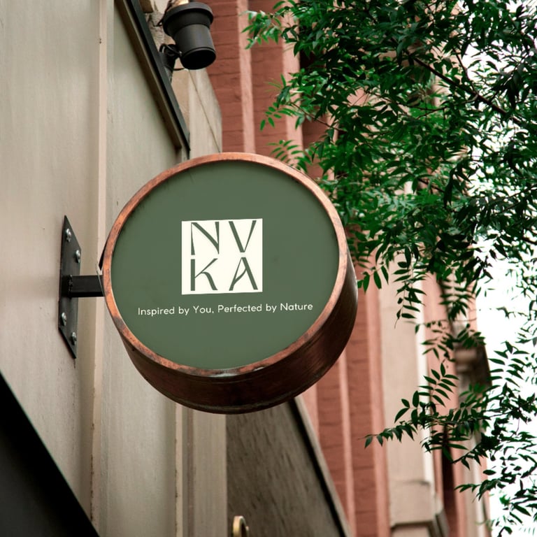
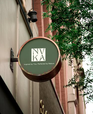
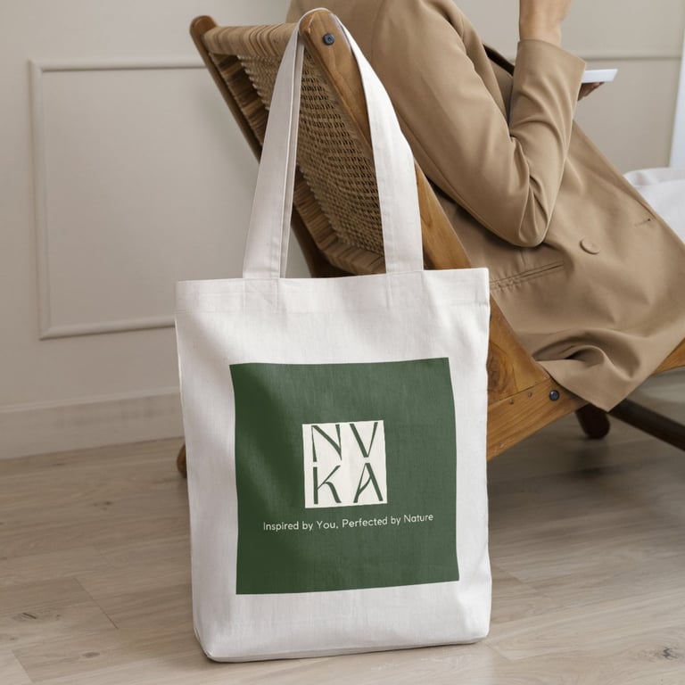
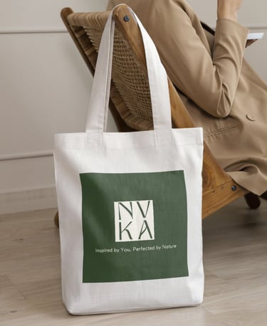
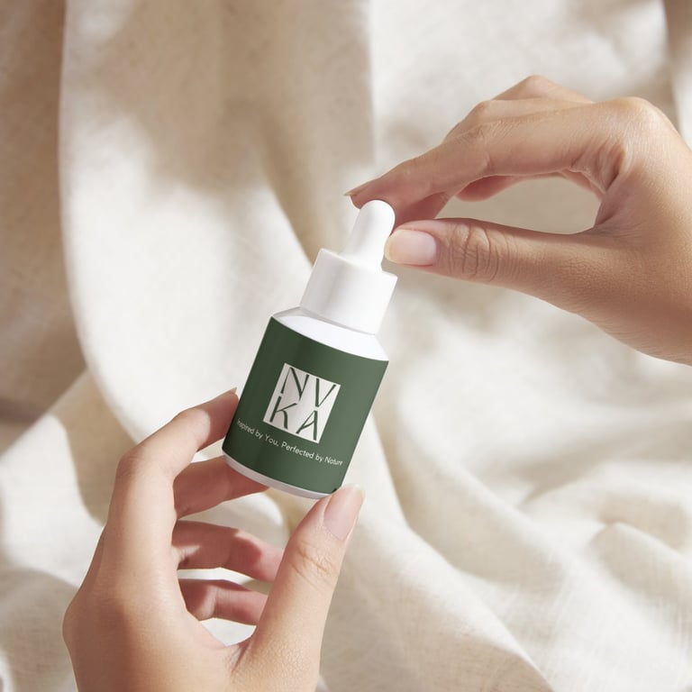
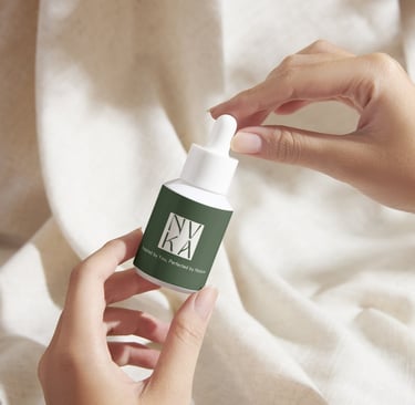
Packaging and go- to-market strategy
Packaging mockups were developed to bring the brand to life and establish a clear vision for how NVKA’s products would exist in the physical world. These concepts defined direction across materials, layout and presentation, ensuring alignment between brand values and shelf presence.
Alongside packaging, a comprehensive brand and go to market strategy was developed to support launch and growth. This included defining positioning, messaging and market entry considerations aligned with NVKA’s organic, research driven ethos, creating a strong foundation for future production, retail and scale.
Naming
Brand Kit Development
Logo Design
Brand Strategy
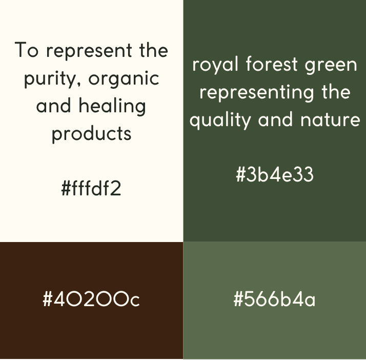
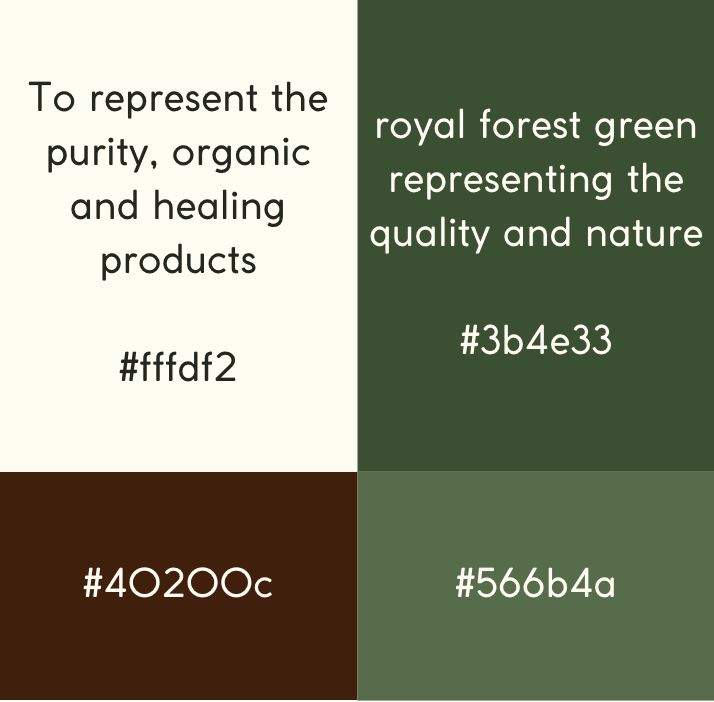
A nature led visual identity
The visual system was designed to reflect NVKA’s connection to nature and clean formulations. Forest green was selected to represent growth, greenery and global botanical roots, while cream toned beige introduced warmth and balance. White accents were used to signify purity, transparency and the integrity of both the products and the people behind the brand. Together, the palette creates a calm, premium aesthetic grounded in nature and trust.