NVKA Skincare
Beauty and wellness / 2025
- Brand Strategy
- Naming
- Logo Design
- Brand Kit Development
- Packaging Mockups
- Go to Market Strategy
Nothing existed yet. No name, no mark, no shelf presence. Just a founder, a set of formulations and a tradition worth translating properly.
The name NVKA is drawn from Anvika. It carries individuality, care and intention, and it compresses to four letters that lock into a square mark without fighting for room.
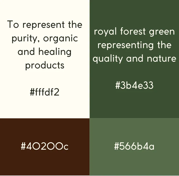
Forest green for growth, greenery and global botanical roots. Cream beige for warmth and balance. White for purity, transparency and integrity. Three colors, held to strictly, which is what makes a young brand look established.
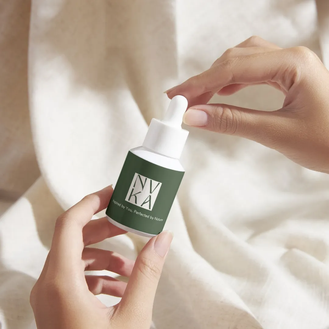
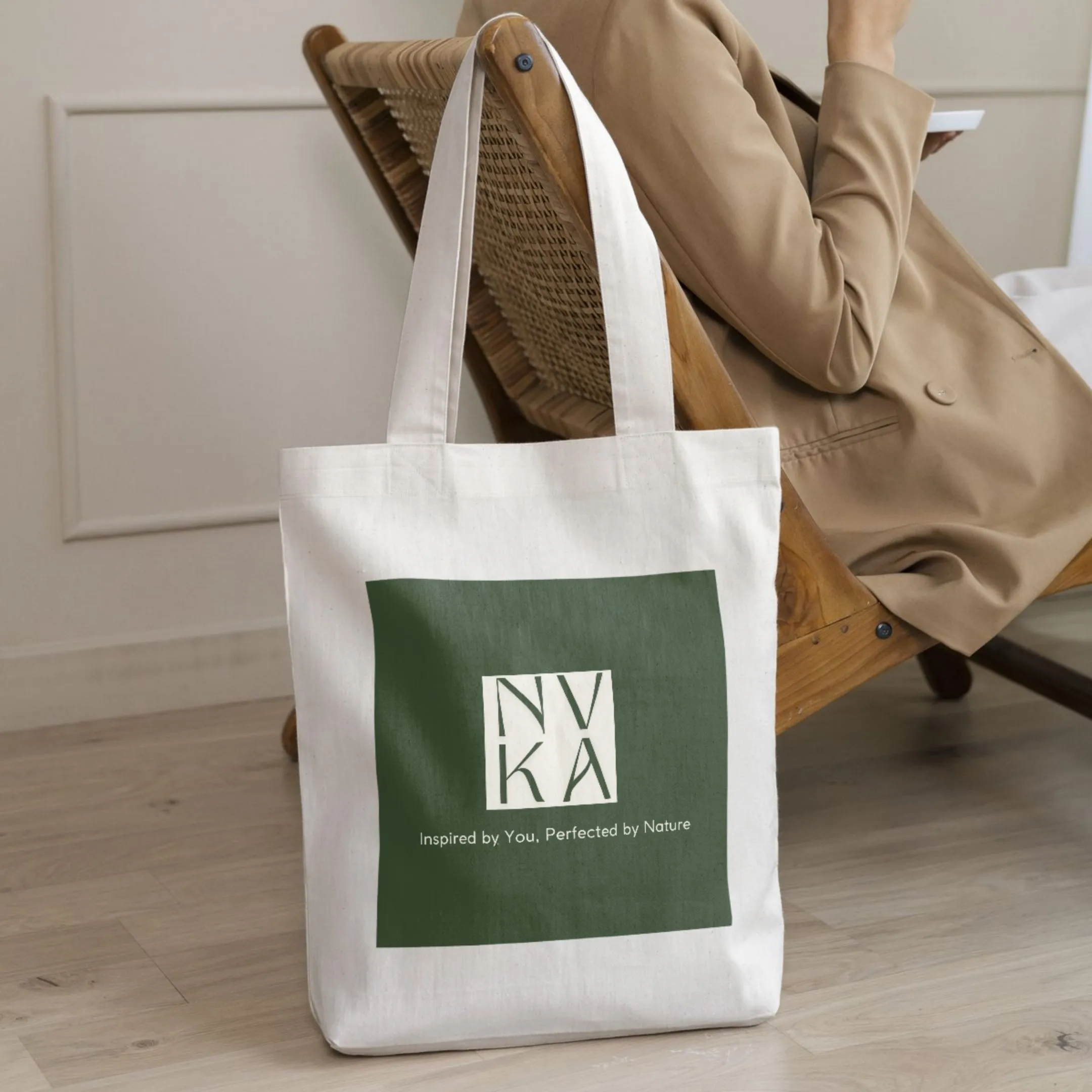
Packaging mockups and a go to market strategy built on category research rather than mood boards. The brand was designed knowing where it would be sold and who it would be standing next to.
Inspired by you, perfected by nature.